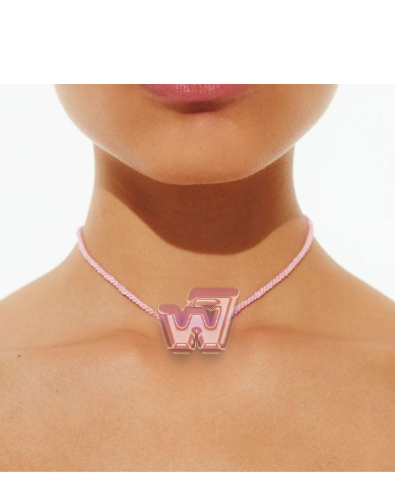
Motion design system for Warner Brothers Records based on the 1960s-70s logo
Warner Brothers Records boasts a large collection of artists and genres within its label. I used the
versatility of the
label to inform my approach to its motion design system, with the logo adapting to the different kinds of imagery
within
the brand.
This particular logo represents the label’s Seven Arts collaboration, combining the former’s W and the latter’s 7. Raveena's poster is based on Fisk Projects' branding for her album Lucid!
This particular logo represents the label’s Seven Arts collaboration, combining the former’s W and the latter’s 7. Raveena's poster is based on Fisk Projects' branding for her album Lucid!


